Sometimes I read a message in a product channel, or sit in a meeting where someone presents a set of metrics that look spectacular.
The graph is going up and to the right. The slide is green. For a moment, it sounds like the product is absolutely flying.
Then I have the slightly annoying thought: yes, but what does this actually mean?
What changed for the customer? What does it mean for the product? And does it tell us anything useful about the strategy, or are we just admiring a number that knows how to look good in a meeting?
Did customers solve something faster? Did they make a better decision?
I do not think the problem starts with bad analytics. It starts when a good-looking result becomes difficult to question. We stop asking what the movement means for the product and the strategy, and start asking how we can make the number move again.
I do not think metrics are neutral
I think every metric is a theory about value.
When a team chooses daily active users, it is saying that repeated activity — and let’s not even get into what “activity” means to each of us — probably means recurring value. When it chooses conversion, it is saying that moving through the funnel is a meaningful sign of progress. When it chooses time spent, it is saying that more attention is good for the customer and the business.
Those may be sensible assumptions. They are still assumptions.
The problem is that the assumptions usually disappear before the number reaches a leadership meeting. We see “activation increased”, not the chain of judgment underneath it.
More messages can mean better collaboration, or it can mean that the product has created more coordination work. More sign-ups can mean genuine demand, or simply that we made it easier to enter and easier to regret it later.
The number cannot tell me which story is true on its own.
The proxy becomes the job
I think most teams do not decide to optimise a bad proxy. They inherit a plausible one, see it respond to an intervention and start treating the response as proof.
Then the target acquires a life of its own. It appears in planning, performance conversations and leadership updates.
People learn which explanations travel well. “Activation increased” is easier to repeat than “activation increased after we changed the definition, while support contacts also rose.”
The product does not need a dishonest person for this to happen. It only needs a number that is easier to defend than the customer experience it is supposed to represent.
When the Metric Had to Catch Up With the Strategy
The example I keep returning to is Amplitude changing its own North Star.
The company originally used weekly querying users as a measure of value. That made sense: Amplitude helped people explore data, and the metric correlated with retention and account growth.
But the company later realised that the measure was too focused on individual analysis. Its strategy had moved toward helping teams learn and act together. So it changed the measure to weekly learning users: people who shared a learning that was consumed by others.
What interests me is not the new label. It is the willingness to admit that a metric can stop representing the product you are trying to build.
The old metric was not mathematically wrong. It was simply less faithful to the value Amplitude wanted to create. “Someone used the analytics tool” was not the same as “the organisation learned something useful from it.”
John Cutler makes a related point in the North Star Playbook: “Powerful ideas imperfectly measured are better than perfect measures for less powerful ideas.”
I read that as permission to start with an imperfect measure, provided we keep checking whether it still represents the idea.
That is also what I notice in Spotify’s approach to experimentation. Spotify separates success metrics from guardrail, deterioration and quality metrics, then connects those results to an explicit shipping decision.
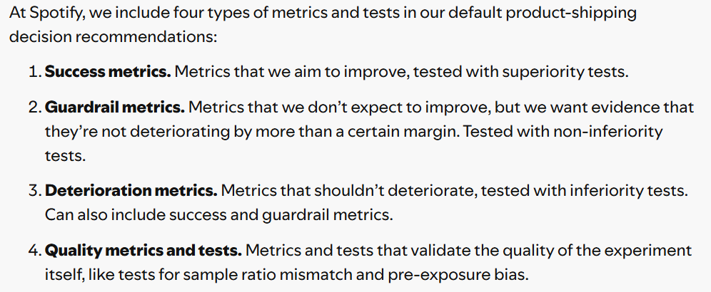
I find that distinction important because many teams run a test as if the only question were whether the treatment beat the control on one favourite metric. Spotify’s approach makes the uncomfortable parts part of the decision rule: a change should not ship merely because one number improved if other evidence says the experience deteriorated or the experiment itself was unreliable.
The lesson is not that every company needs Spotify’s exact statistical machinery. The lesson is that a metric needs a job in a decision. Otherwise, it becomes a trophy.
What a metric is asking us to learn
This is where I find the work of Marty Cagan and Teresa Torres useful. They are both pushing against the same comfortable shortcut: treating the metric we already have as if it had already told us what matters.
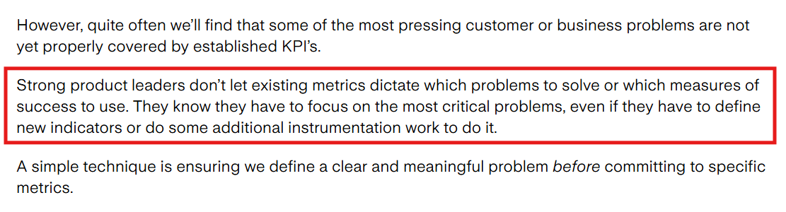
Cagan’s point, as I read it, is that product teams should choose the outcome they want to influence instead of letting the existing dashboard choose the problem for them. Teresa Torres makes the idea practical by distinguishing an outcome from an output: an outcome is the impact our work has on customers or the business. She also describes product outcomes as customer behaviours or sentiment that can act as leading indicators of business outcomes. That gives the team something closer to a product outcome than a proxy metric.
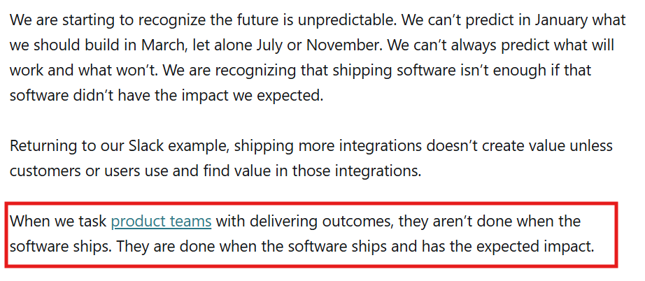
That changes the question I bring to a metric review. I am less interested in whether the number is impressive than in what it allows us to learn. Did the customer experience improve? Did we discover a behaviour worth encouraging? Did we find evidence that our product bet is working, or did we simply become better at producing the event we decided to count?
For me, this is the PM’s job in the space between a result and a decision: keep the chain visible. The metric should point back to a customer problem, a product bet and a reason to act. If I cannot follow that chain, I do not yet know whether the number went up for a good reason.
My take
I am not worried about using imperfect metrics. They have to start somewhere.
I am more worried about what happens when the metric stops being a way to learn and becomes a way to protect a story.
A number goes up, so we call the product healthier. The team gets praised, so the behaviour behind the number becomes the thing to produce. Slowly, the metric stops testing the strategy and starts replacing it.
That is the moment I want product teams to interrupt.
Not with a demand for perfect measurement, but with a simpler question:
what is now better for the customer that was not better before?
If we can answer that, the metric has helped us learn.
If we cannot, then the metric may have gone up while our understanding of the product stayed exactly where it was.
And that is not a product win. It is only movement.